I am very font of you—you're just my type
Josh BurnsDate: January 25, 2019 | Time: 2 min to read
Typography can establish the visual hierarchy and cohesiveness, highlighting what is important and helping the audience easily navigate content.
I have always been amazed at all the fonts out in the wild. It is remarkable the amount of time that has gone into creating each font. Here is a perspective on typography. It is a simple perspective that has helped keep me on track.
Use One Font
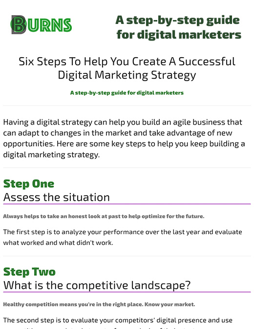
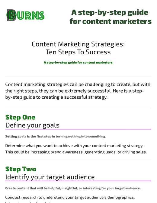
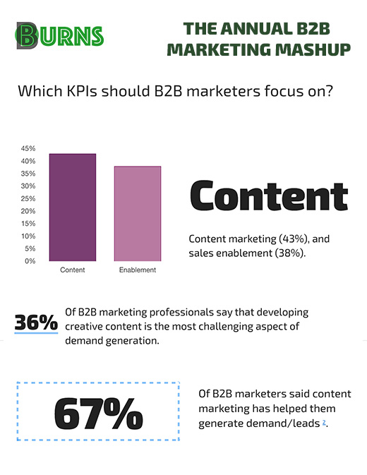
Choose a well-designed font and explore all of its weights, this works best with variable fonts. If a font you like does not have multiple weights, you could utilize colors to create contrast between headings and body text. This site uses Exo 2 and a variety of weights.
Use Traditional Point Sizes
You can’t learn typography overnight. If you are at a loss, it would be safe to utilize the set of traditional point sizes. Remember to convert the point value to rem when designing for the web.
Redefine Point Sizes for CJK Characters
CJK (Chinese, Japanese, Korean) characters are wildly different from Latin characters. Make sure to pick point sizes that would look good with CJK characters.
Use En Dash & Em Dash
The em dash—the long dash—is for indicating a break in the sentence. The en dash is slightly wider than the hyphen and narrower than the em dash, and it should be used for span or range of numbers. Hyphen is for hyphenation.
Use One Space after a Period
Digital typefaces are designed with proper kerning. Let obsolete practices stay in the past.
Reduce Heading Spacing
The spacing between a heading and a paragraph should be less than the regular paragraph spacing. If regular paragraph spacing is used instead, the heading would seem too far away from the paragraph.
So what is the takeaway here?
Typography is important because it serves multiple purposes. In addition to the hierarchy, it helps us communicate the messaging tone and sentiment of a design piece. Enhancing the aesthetics of a design and making it easy on the eyes and easier to consume.
Typography is a required tool of the trade. The impact it has on the digital experience is immense. Start learning more about typography through online guides and books.
Typography, a symphony of shapes. The dance of letters
— Josh Burns
Resources


